Premium Takeaway Packaging for Resorts: Finishes That Justify the
Premium Takeaway Packaging for Resorts: Finishes That Justify the Price Point
Guests judge a resort's food program before they taste it, and the takeaway container is often the first artifact they hold. Premium-look packaging is not one feature but a stack of decisions: heavyweight board that keeps its shape in a delivery bag, a matte surface that signals calm quality, a restrained foil-stamped mark that catches the light once, embossed detail that rewards touch, and clean print where the menu story needs it. This guide explains how foil stamping works, what each foil
Start with the material, not the decoration
No finish rescues weak structure. Guests notice a box that softens or a lid that pops open long before they notice the logo, so the premium decision starts with the board and the form: heavyweight board that resists crushing on a room-service tray or in a delivery bag, walls and rims that stay square when stacked, and lids that close without force.
On top of that structure, two surface choices do most of the quiet work. A matte finish reads as calm, considered quality and gives any brand mark the highest possible contrast stage. Kraft and other natural, uncoated-looking papers read as warmth and craft, and they pair naturally with warm metallic accents. Decide the material and surface first; the finish then has something worth sitting on.
How foil stamping works
Foil stamping is a dry process: a foil layer — metallic or pigmented — is pressed onto the surface by a heated die cut to the artwork's outline, transferring the design in one pass. Heat softens the foil's adhesive layer so the metallic film fuses to the substrate and separates from its carrier at the same moment.
Because it is applied after base printing, foil becomes the final — and usually the most visually dominant — surface element, with crisp edges and a continuous metallic reflectivity that ink cannot replicate. The substrate is not a bystander: its texture and coating affect adhesion, edge definition, and the contrast between foil and background, which is why the finish and the material have to be chosen together.
The foil family and what each colour signals
Gold is the foundational luxury signal — authority, heritage, established quality — in tonal variants from bright and assertive to pale champagne and deep antique. It works hardest on one precisely defined element — logo, monogram, or wordmark. Rose gold carries warmth and contemporary elegance and sits harmoniously on white, cream, and blush bases.
signals precision and modernity. Bright silver is the most assertive metallic at close range; brushed or matte silver reads refined on minimal designs. foil communicates exclusivity through depth rather than shine — matte black on a matte black surface is nearly invisible in direct light and reveals itself as the viewing angle changes, one of the most sophisticated effects available. speaks craft and artisanal warmth and is the natural partner for kraft and uncoated surfaces.
Silver
Black
Copper
Holographic foil shifts colour with movement, making it the most attention-commanding and most shareable finish for younger audiences. Coloured foils, matched to a brand's Pantone reference, keep colour consistent across packaging and print touchpoints. Across the whole family, one rule holds: restraint amplifies the signal. One stamped element beats a pattern fill every time.
Combinations and pairings that earn their cost
Foil combined with embossing forms the metallic element and its raised relief in one pass through the press — the most demanding combination and the clearest statement of manufacturing investment, best reserved for the brand mark itself. Foil on a debossed, recessed element pairs depth with reflectivity, especially effective on heavyweight textured board. Selective spot UV adds a wet-look gloss beside a foil mark for layered contrast, and foil over a matte laminate remains the most requested premium pairing, because the velvety non-reflective base maximises the foil's shine. Multi-foil layouts build hierarchy: one colour for the brand mark, a second for secondary detail.
Pairing with the base is the other half of the decision. Gold on black is the highest-contrast combination in premium packaging; gold on white or cream reads heritage; rose gold on blush reads contemporary; black on black reads exclusive; copper on kraft reads artisan. Foodservice adds one filter before choosing: the surface will meet moisture, grease, heat, and stacking, so every finish must be validated on the actual substrate and coating rather than assumed from a sample made on another material.
Brief the finish so the result matches the artwork
Most finish disappointments are briefing failures, and they are avoidable:
Specify colour by reference number, not description. "Gold" is not one colour: dozens of variants exist, each with its own tone and reflectivity. Ask for a physical swatch before confirming.
Supply vector artwork with the finish element on a separate layer, so the area to be stamped is unambiguous.
Confirm compatibility early between the foil and the substrate and its coating. Lamination choice changes foil adhesion, and it is far cheaper to catch at the mockup stage than after printing.
Name the combination and the die type if embossing or debossing is involved.
Approve a physical sample on the real item before production proceeds.
For print more broadly, the same discipline applies. Where photography matters — a signature dish on a grab-and-go line, for instance — treat photo-quality print as its own specification and ask which print method, ink coverage, and colour controls your supplier recommends for that exact substrate.
The resort look, translated into takeaway formats
Two product families carry most of this visual language in foodservice.
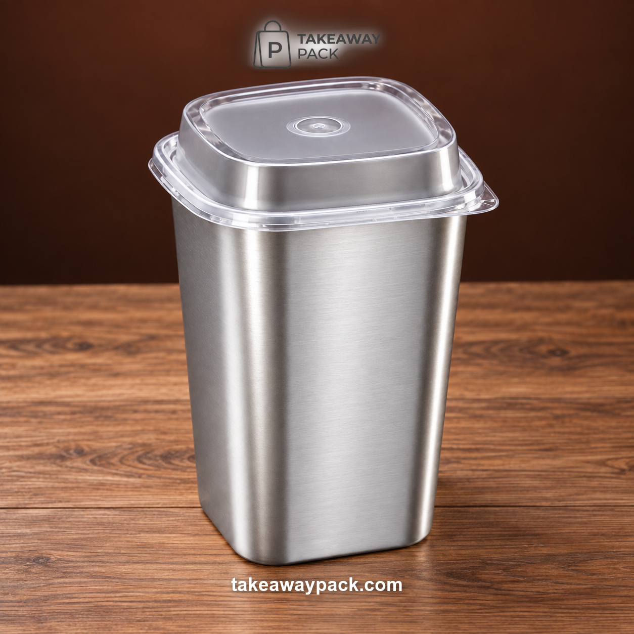
Metallic and colour-shifting drinkware: bright-silver and matte-silver film square cup sets in 650 ml and 960 ml with clear lids, plus matching bright- and matte-rainbow-film versions, put the silver and colour-shift signals onto a polypropylene cup for beverage service. The bright-versus-matte choice mirrors the foil decision above — bright reads assertive, matte reads refined.
Warm craft substrates: natural kraft bowls, rectangular containers, soup cups, and trays deliver the artisan warmth of the copper-on-kraft pairing with no added finish at all — the substrate is the design, and a one-colour brand mark sits comfortably on it.
Takeawaypack works across exactly these formats — cups, bowls, boxes, containers, trays, lids, bags, and cutlery — combining its own printing plant with a network of partner factories for custom printed packaging in small batches, serving foodservice buyers across North America, Europe, Australia, the Middle East, and Japan and Korea. A request starts with your product or category, material, size or capacity, estimated quantity, printing or logo requirements, and destination port or country; at inquiry stage you can align structure, coating, printing, lid matching, and export packing. Custom artwork is returned as a digital proof, and production begins only after your written confirmation, with samples and print-file alignment arranged beforehand. Sourcing information describes MOQs as flexible — some in-stock items support trial orders, while custom MOQs depend on the product and production method.
For sustainability teams: environmental claims attach to products, not to supplier catalogues. Within Takeawaypack's supplier network, factories hold FSC chain-of-custody and GRS 4.0 credentials, and select kraft lines may carry compostable or recyclable certification — ask which certificate covers your exact SKU before printing any claim guests will read.
Quick answers before you specify
Which upgrade makes takeaway packaging look premium fastest?
A matte surface plus one restrained metallic brand element. A non-reflective base against a single foil-stamped or metallic-film mark is the pairing audiences read as premium fastest, and restraint is what keeps it quality rather than decoration.
Can special finishes like foil be used on food packaging?
Treat it as a per-SKU question, not a given. Finishes are normally specified away from direct food contact and must be validated on the actual substrate and coating — ask your supplier which finishes are practical for the cup, box, or bag you have in mind, and confirm on a physical sample before the production run.
How should a resort brief custom printed packaging?
Send vector artwork with brand colours referenced by code (Pantone where your brand uses it), mark the print placement, and list the SKUs and estimated quantities. Expect a digital proof to approve in writing, and request a physical sample on the real item before production.
Will premium finishes change the environmental story?
They can. Coatings, films, and foils affect how an item travels through recycling or composting streams, so environmental claims must be made per SKU with evidence. Where a claim matters to your program, request the certificate covering the exact item rather than relying on a general material statement.
For a resort takeaway program specified around your menu, visit Takeawaypack.