What Makes Takeaway Packaging Look Premium? Board, Coating and Finish Choices for Resorts
Premium takeaway packaging is built in a specific order: the board sets the baseline, the coating sets the light, and one or two deliberate finishes carry the brand. For hotels and resorts, the difference between packaging that supports a premium price point and packaging that reads as an afterthought usually comes down to heavyweight board where guests handle the item, a matte or gloss surface strategy that suits the food, and a single decorative accent rather than many competing effects. This
Premium Is Decided by Material First, Finish Second
A finish is a production step added on top of a printed piece, and every added step costs time and money. That is exactly why restraint reads as premium: strong packaging design usually commits to one or two deliberate finishes rather than many competing ones. A resort logo in a single metallic accent on a matte surface says more than five effects fighting for attention.
The material decides what is possible before any finish is chosen. The same foil, coating or emboss behaves differently on a smooth bleached board than on a textured natural paper, so name the effect you want and let the material and structure guide what will execute well. For takeaway formats, the guest also touches the container, the lid and the bag — weight in the hand is the first premium signal, which is why board stiffness and a clean fold matter as much as anything printed on the surface.
Surface Finishes: Matte, Gloss, Varnish or No Coating
Surface finishes set how the piece reflects light, and light is what guests read as quality at first glance.
Matte lamination applies a non-reflective protective film. It produces an understated, even tone widely used for premium looks, and it pairs well with a foil accent placed on top of the matte field.
Gloss lamination applies a reflective film that deepens colour saturation. It suits vibrant brand palettes and foodservice settings where a wipe-clean surface is practical.
Varnish is a liquid coating applied on press — the economical route to protection and sheen control when budgets rule out film.
No coating at all is a deliberate choice, not an omission. Uncoated kraft with a single-colour print projects a natural, honest look many resort and beach-club brands prefer to any film.
Each option changes both the look and the unit cost, so the decision belongs in the brief, not as a surprise at the printer.
Decorative Finishes: Foil Stamping, Embossing and Debossing
Decorative finishes add dimension where it matters most: the logo, the edge, the one accent a guest remembers.
Foil stamping presses a metallic foil onto the surface — logos, edges and small accents on luxury and gift-oriented pieces. On takeaway packaging it works best as a single focal point.
Embossing presses a raised detail into the material, creating a logo or pattern guests feel before they see.
Debossing leaves the detail recessed; on thicker boards it reads as quiet, confident branding without any added colour.
Placement discipline matters more in takeaway than in retail boxes, because grease, moisture and handling attack the surface. Concentrate decoration on the zones guests see first, keep it clear of fold and sealing areas, and confirm with the supplier that the chosen finish will hold on the actual substrate and structure.
Photo-Quality Print: Where Full-Colour Branding Works
Resort brands often want photography or rich gradients on guest-facing items, and full-colour process printing can carry that — but the substrate decides how true it looks. Photography and dense colour show most accurately on white or light, evenly coated surfaces; uncoated kraft absorbs and mutes ink, which is why kraft pieces read best with a single colour and simple line art.
A practical rule: choose one surface strategy per item, not per brand. A resort can run photographic print on white board items for in-room dining and single-colour kraft for poolside service, and both look intentional. Colour outcomes should be confirmed on the exact material before production — a printed proof made from the final artwork file, approved in writing, is the standard control that keeps brand colour from drifting between items and reorders.
Structural Details That Signal Quality
Several structural details contribute to a premium read without adding printed decoration:
Die-cut windows reveal the product itself, usually paired with a film patch to keep the opening food-safe — for pastries and desserts, the product becomes the visual.
Custom die-cut shapes take silhouettes and closures beyond straight edges.
Creasing and scoring produce clean, accurate folds on heavier boards — the detail that prevents cracked edges on heavyweight takeaway items.
Inserts — die-cut board or fitted trays — hold products in place, which matters for afternoon-tea boxes and multi-item orders.
Guests register these details as overall quality, even when they cannot name them.
Combinations That Consistently Work
Certain pairings succeed because each element covers the other's weakness. Feasibility always depends on the material and structure — a finish that excels on smooth paperboard may behave differently on textured natural paper — so treat these as starting points and confirm on a finished sample.
Matte lamination plus gold or silver foil — the classic luxury pairing: a quiet matte field with one metallic accent.
Kraft board plus single-colour print — natural, honest and cost-effective, scaling from coffee cups to meal boxes.
Gloss lamination plus strong colour — maximum tray impact for vibrant foodservice branding.
Debossing plus textured wrap on rigid pieces — quiet luxury that relies on touch rather than ink.
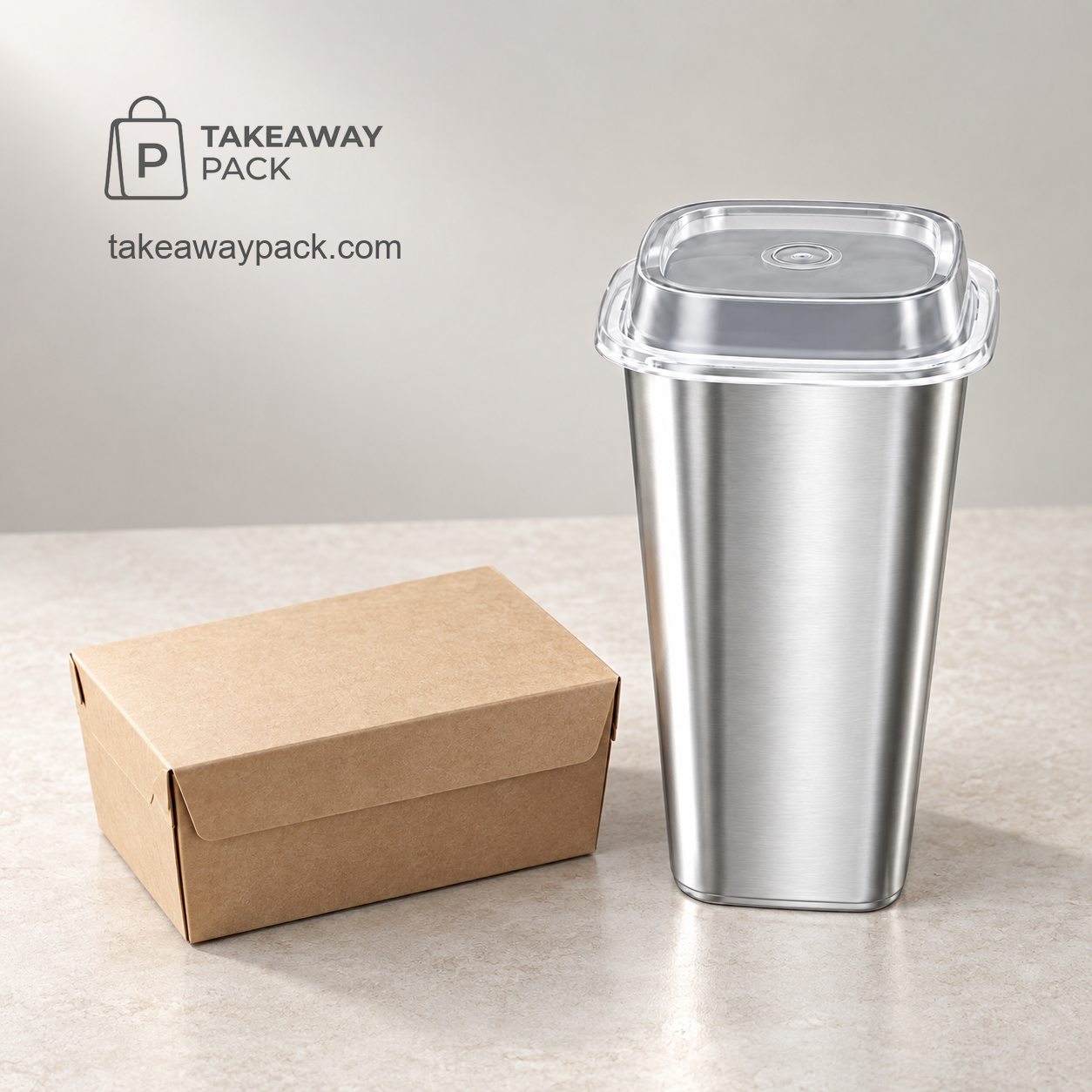
Material can also carry the premium effect with no finishing step at all. A metallised film built into the cup body gives a bright or matte metallic look straight off the shelf — TakeawayPack's square PP cup sets in 650 ml and 960 ml, finished in bright or matte silver film with clear lids, are a ready example for beverage and dessert service. The same logic applies at the natural end of the range: kraft rectangular food containers in 500–750 ml sizes deliver the uncoated natural look with nothing more than a single-colour logo.
A Sourcing Checklist for Resort and Hotel Procurement
Before shortlisting a supplier for premium takeaway items, put these points in the request:
Name the finish in the brief — matte or gloss, the accent effect, and the surface it should appear on, so quotations are comparable.
Demand a finished-material sample — confirm the effect on the actual substrate and structure, not on a swatch book.
Fix the proof discipline — a digital proof prepared from your artwork file, produced only after your written confirmation, is the baseline control for brand colour and placement.
Match the structure to the menu — discuss structure, coating, capacity, printing and lid matching at inquiry stage, so the premium look never compromises food performance.
Clarify order terms early — flexible MOQ handling matters for seasonal menus; some in-stock items may support trial orders, while custom MOQ depends on the product and production method.
Treat environmental claims as per-SKU evidence — only select kraft and molded-pulp lines carry compostable or recyclable certification directions, and certificates belong to the specific product rather than a supplier catalogue, so request the certificate for each SKU. Where responsibly sourced fiber is part of the brief, documentation can be evidenced through the supplier network, which includes a factory holding FSC Chain-of-Custody certificate GFA-COC-006105 (valid to 2027-02-09) and GRS 4.0 certificate TE-00121899 (valid to 2026-11-18); these belong to the network factories, not to the brand as holder.
Quick answers
Which finish makes takeaway packaging look the most premium?
The most consistent premium read is a matte surface with one metallic foil accent on the logo. Restraint is the signal: one deliberate finish reads as quality, stacked effects read as clutter.
Is heavyweight board worth it for takeaway items?
Where guests hold the item — bags, rigid boxes, dessert formats — board weight is the first premium signal, and it enables clean creasing. The trade-off is unit cost and shipping weight, so reserve it for the most brand-visible items.
Can photo-quality printing be used on kraft board?
It can be printed, but uncoated kraft mutes colour and detail, so photography rarely looks the way it does on screen. Keep photographic work for white or light coated surfaces and confirm both on proofs.
How can a smaller property get a premium look without a large custom run?
Use material-driven effects instead of added finishing steps — natural kraft with a single-colour logo, or metallised-film cups that carry a metallic look as manufactured. Flexible MOQ handling on some in-stock items makes a trial order a realistic first step.
TakeawayPack manufactures custom-printed foodservice packaging — cups, bowls, boxes, containers, trays, lids, bags and cutlery — through its own printing facility and partner factories, serving hotel, resort and restaurant buyers across North America, Europe, Australia, the Middle East and East Asia. To request samples, a digital proof or a quotation built around your menu and destination market, visit TakeawayPack.