Which Materials and Finishes Make Resort Takeaway Packaging Look
Which Materials and Finishes Make Resort Takeaway Packaging Look Premium?
Takeaway packaging looks premium to a resort guest when material substance and surface finish are specified together: a board or container format that holds its shape in the hand, a matte or low-gloss surface, restrained metallic accents, accurate custom printing from approved artwork, matched lids and one coherent color story across every item the guest touches, and responsible-sourcing documentation the procurement team can verify. No single finish carries a price point on its own. Each
What makes takeaway packaging read as premium to a resort guest?
At a resort, takeaway packaging almost never stays at a counter. It travels to a pool cabana, an in-room table, a beach lounger, or an event lawn, and the guest judges it in the hand: whether a cup or box feels solid, how the surface responds to light, how sharply the print reads, and whether the cup, lid, box, and bag look like one packaging program rather than random purchases.
Those judgments map to attributes a procurement team can actually specify: structural substance, surface quality, print accuracy, color coherence, and documented responsible sourcing. Treating "premium" as a checklist of testable attributes — instead of an adjective — is what allows packaging to support a resort's price point with evidence rather than hope.
Which board and material choices carry visual weight?
Rigidity is the first signal. A bowl that keeps its shape, a box with crisp edges, and a tray that does not flex when lifted all read as quality, because the material is visibly doing its job. This is why board weight and format construction deserve attention before any surface decoration is discussed: a finish cannot compensate for a pack that feels flimsy.
The material choice also sets the color base for everything printed on it. Unbleached kraft carries a warm, natural tone that fits the earthy palettes common in resort dining and photographs well in guest-created content. White paperboard gives the opposite starting point: a neutral base where full-color artwork and fine print detail render at their most accurate. Both directions exist in working foodservice catalogs — kraft soup cups, salad bowls, trays, and food boxes on one side; white cardboard boxes on the other — so the decision is a per-menu design choice, not a catalog limitation.
A shortlist built from one supplier's range of cups, bowls, boxes, containers, trays, lids, bags, and cutlery can then follow one material logic across the whole program instead of mixing unrelated looks.
How do matte finishes change perceived value?
Matte surfaces scatter light; high-gloss surfaces reflect it. Around a pool or on an open terrace, a matte surface tends to read consistently while gloss picks up glare and fingerprints. Matte is also commonly chosen in packaging design for a restrained, contemporary look — one that invites a closer look rather than shouting across a room.
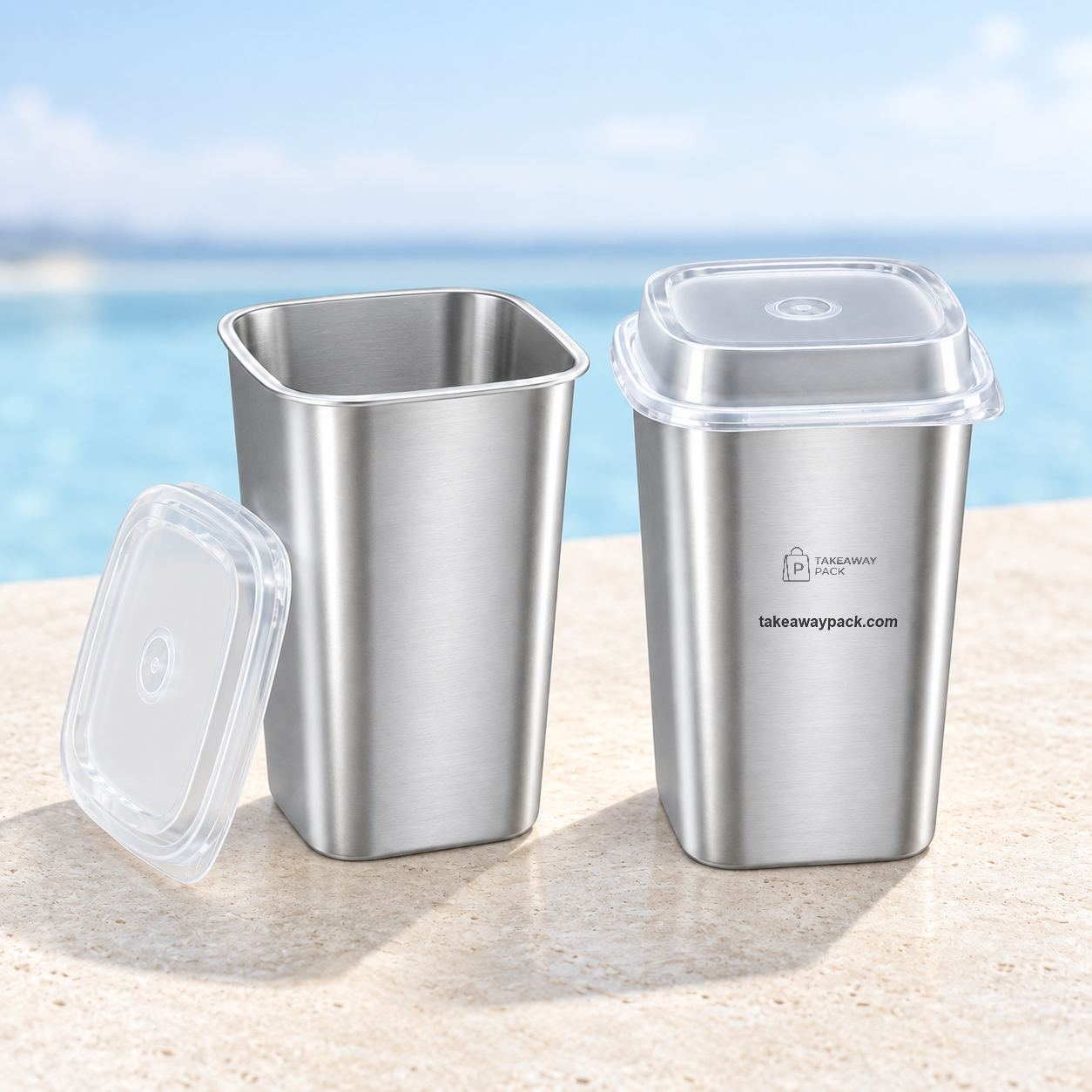
Matte effects are not limited to coated paperboard. TakeawayPack's catalog, for example, includes PP square cup sets in 650 ml and 960 ml sizes finished with matte silver film or matte rainbow film, with clear or clear-gray lids — a matte metallic look carried on a disposable beverage format. Whether a matte coating or matte film can be applied to any other specific product is a per-SKU question: coatings are one of the items a supplier can discuss at inquiry stage, and the answer should be confirmed on a sample, not assumed from a material name.
Where do embossing and texture belong in takeaway packaging?
Texture works because so much packaging is flat. A pressed pattern, an embossed detail, or the natural grain of a fiber surface gives guests a tactile cue before they see any logo — and touch is evaluated in real time as the pack is carried and opened.
On disposable foodservice products, which texture is achievable depends on the product's construction and the production process behind it. Rather than treating "embossing" as a checkbox, name the effect you want the guest to feel — a debossed pattern on a lid area, a textured sleeve, a ribbed wrap — and ask the supplier which of your candidate SKUs can carry it. The sample, again, is the decision document: texture that looks refined on a mockup can feel sharp, faint, or uneven in production, and only a physical check settles it.
Are foil and metallic accents appropriate on disposable packaging?
Metallic accents read as premium when they are rationed. One foil-style logo, one band, or one pattern element on an otherwise calm surface draws the eye; metallic coverage across the whole pack reads as clutter and dates quickly. The design principle of restraint and precision over coverage applies with equal force on a disposable format.
There is more than one route to the effect. Foil-type finishing processes apply metal to the surface directly; metallic-effect films build the look into the material itself, as in the bright silver film and matte silver film cup sets referenced above. Which process fits which product varies by SKU and print method, so confirm the available route for each item at quotation, then approve it on the printed proof and the sample — never on a render alone.
What does photo-quality printing require before production?
Photographic print quality is produced by a process, not a promise. TakeawayPack operates as a printing factory and works with multiple disposable foodservice packaging factories, so custom printing starts from the customer's artwork files: a digital proof is produced from those files, and production begins only after the customer confirms the proof in writing. That workflow is what makes fine gradients, small type, and detailed logos checkable before commitment rather than after delivery.
Two planning points matter for resorts. First, color behaves differently by substrate: the same artwork renders differently on unbleached kraft than on white stock, so judge the proof for the actual material, and adjust artwork expectations for warm bases. Second, written artwork approval confirms the print, not the pack — it does not certify fit, lid behavior, or how the finished item survives the service route. Proof approval and physical sample evaluation are two separate gates, and a premium program needs both.
Why do structure, lids, and the opening moment matter?
The outside of the pack sets the expectation; the moment it opens delivers it. Structure decides how the food arrives: a compartmented tray keeps components in place, a wire-handle pail presents a shareable portion, a matched lid closes the pack cleanly for the walk back to the room. These are experience decisions as much as protective ones, and they belong in the same design conversation as materials and finishes.
Lid matching should be treated as a specification, not an assumption. Soup cup lids, for instance, exist in paper and PLA versions matched to a 96 mm rim — the base-and-lid pair is what gets tested, because a lid that is nearly the right size is still the wrong lid. Structure, coating, capacity, printing, lid matching, and carton packing are all items a supplier can align at inquiry stage, which is exactly when changes cost the least.
Finally, design the reveal for where it happens: a guest opening the pack in a room, on a lounger, or at an event table should find food presented the way the kitchen intended, not half-unwrapped by the journey.
How does sourcing documentation support a premium position?
Sustainability and premium presentation are no longer opposing briefs; procurement teams increasingly need packaging that is both presentable and defensible. The defensible part is documentation, and the wording has to stay precise. Select kraft and molded-pulp lines may carry compostable or recyclable certification — those certificates belong to the specific products, not to a supplier catalog as a whole, so request certificates per SKU rather than accepting a blanket claim.
Within its supplier network, TakeawayPack can point to certificates held by its partners: an FSC Chain of Custody certificate (GFA-COC-006105, Wenzhou Chenglong Paper Plastic Products Co., Ltd., valid to 2027-02-09) and a GRS 4.0 certificate (TE-00121899, valid to 2026-11-18). These are held by the supplier network's certified companies, not by TakeawayPack as certificate holder, so the correct procurement step is to request the current, SKU-specific certificate documents for the exact products being ordered.
How should a resort team run the packaging shortlist?
A disciplined sequence keeps the premium intent intact through procurement:
Map each venue — pool service, in-room dining, grab-and-go, events — to the formats it actually needs.
Write a short brief per format: dishes, portions, serving conditions, carrying route, and the guest-facing look.
Request samples and align print files with the supplier before evaluating anything on paper alone.
Test the complete pack — base, matched lid, print, bag — under the real route, with the staff who will pack it.
Submit the RFQ with product category, material, size or capacity, estimated quantity, printing and logo requirements, and destination market.
Confirm structure, coating, printing, lid matching, and carton packing for each SKU at inquiry, approve the digital proof in writing, then release production.
Order quantities deserve an early conversation too. Minimum order quantities are handled flexibly: some in-stock items may support trial orders, while custom-printed MOQs depend on the product and the production method behind it — so a pilot across two or three venues can often start smaller than a full-property rollout.
Frequently asked questions
Which finish has the biggest effect on a premium impression?
None on its own. Rigidity and board substance come first, because a flimsy pack undermines any surface treatment. Matte or low-gloss surfaces, restrained metallic accents, accurate printing, and coherent colors then compound: the premium impression is the stack, verified on a sample.
Can kraft packaging look premium enough for a resort?
Yes, when the format is substantial and the print is restrained. Kraft's natural tone aligns with resort palettes and natural-material storytelling; keep artwork to limited colors, expect color to render warmer on kraft than on white stock, and judge it on the printed proof for that substrate.
Can custom printing be ordered in small quantities?
MOQs are handled flexibly rather than as one fixed rule. Some in-stock products may support trial orders; custom-printed MOQs depend on the product and production method. State the pilot quantity in the RFQ so the supplier prices the realistic scenario.
Do embossing and foil work on disposable food packaging?
Availability varies by product construction and process — neither effect is a given on every SKU. Name the effect you want, ask which candidate products can carry it, and confirm on a physical sample and an approved proof before ordering.
What sustainability documentation should procurement request?
Per-SKU certificates for any compostability or recyclability claim, since certification attaches to products, not catalogs. Supplier-network certificates such as FSC CoC GFA-COC-006105 and GRS 4.0 TE-00121899 support responsible-sourcing discussions, but request the current documents covering the exact SKUs being purchased.
What should the RFQ include?
Product category, material, size or capacity, estimated quantity, printing and logo customization, and destination port or country. Adding structure, coating, and lid-matching requirements at the same time lets the supplier quote the complete specification instead of a base product.
Present packaging that matches the room it arrives in
A resort's takeaway packaging is part of the product the guest already paid for. Specify the materials and finishes that hold up in the hand, in the light, and in the room — then verify them per SKU. To start a materials, finishes, and custom-printing discussion for your property's takeaway program, visit TakeawayPack.