Event Catering Packaging Information Systems: How to Verify Print Zones for Dietary Meal Boxes
For conference catering, a meal box becomes part of the handoff system—not merely a container. When the box must show a catering brand, dietary category, allergen advisory, and classification note, the practical question is not “Can we fit all the words?” It is whether each message has a defined information role, an assigned artwork zone, and a repeatable proof-and-approval path before a production order begins.
2026-08-16 - 10 min read
Summary
For conference catering, a meal box becomes part of the handoff system—not merely a container. When the box must show a catering brand, dietary category, allergen advisory, and classification note, the practical question is not “Can we fit all the words?” It is whether each message has a defined information role, an assigned artwork zone, and a repeatable proof-and-approval path before a production order begins.
This guide explains how event teams can reduce meal-box confusion with a packaging information system. It covers what to put in the primary, secondary, and handoff-facing print areas; how to keep an artwork file readable in a busy distribution line; and how to ask a packaging supplier to validate production feasibility for the specific box, material, artwork, quantity, and destination.
Why Conference Meal-Box Information Needs a System
A dietary meal handoff has several people, several moments, and very little time. Kitchen staff need to identify the intended classification while packing. Event staff need to sort meals into the correct pickup area. Attendees need to recognize their meal without opening or moving every box. If a question arises, the event lead needs a clear way to escalate it rather than guess.
That means one small package may carry four different kinds of information:
- Contract catering brand: identifies the catering program or event food service.
- Dietary category: the fast, high-priority routing cue, such as *VEGAN* or *GLUTEN-FREE*.
- Allergen advisory: concise wording supplied through the caterer’s approved information process.
- Classification note: a short explanation that prevents a category from being misunderstood—for example, a direction to check the advisory or ask the event exception lead.
These messages do not have equal priority. A brand can be visible and consistent without competing with the dietary category. A category needs rapid recognition. An advisory needs enough space to be read accurately. A classification note needs to clarify, not add another competing label.
The goal is an information hierarchy that stays intact from packing bench to pickup table.
Build the Content Hierarchy Before Choosing a Print Location
Start with a single approved content sheet for every category. It should list the exact category name, any color or icon convention, the approved advisory wording, the classification note, and the person responsible for approving changes. This avoids a frequent failure point: the registration spreadsheet, kitchen ticket, box artwork, and pickup sign all using slightly different terms.
A practical hierarchy is:
| Information | Job in the handoff | Relative prominence |
|---|---|---|
| Dietary category | Routes the meal quickly | Highest |
| Category color or icon | Supports rapid visual sorting | High, but never the only cue |
| Catering brand | Identifies the food-service program | Medium |
| Allergen advisory | Provides the approved caution or direction | Medium, readable at close range |
| Classification note | Explains the category boundary or next action | Supporting |
Use words as well as color. Indoor lighting, stacked boxes, distance, and individual visual differences can make a color-only system unreliable. A large, consistent category name is the main decision cue; color and iconography are supporting cues.
Keep category names stable across the event. If a meal is routed as “VEGAN,” do not relabel it later as “PLANT-BASED” on another package or sign unless the team has deliberately defined the two terms as the same operating category.
The Three Artwork Zones to Validate for Meal Boxes
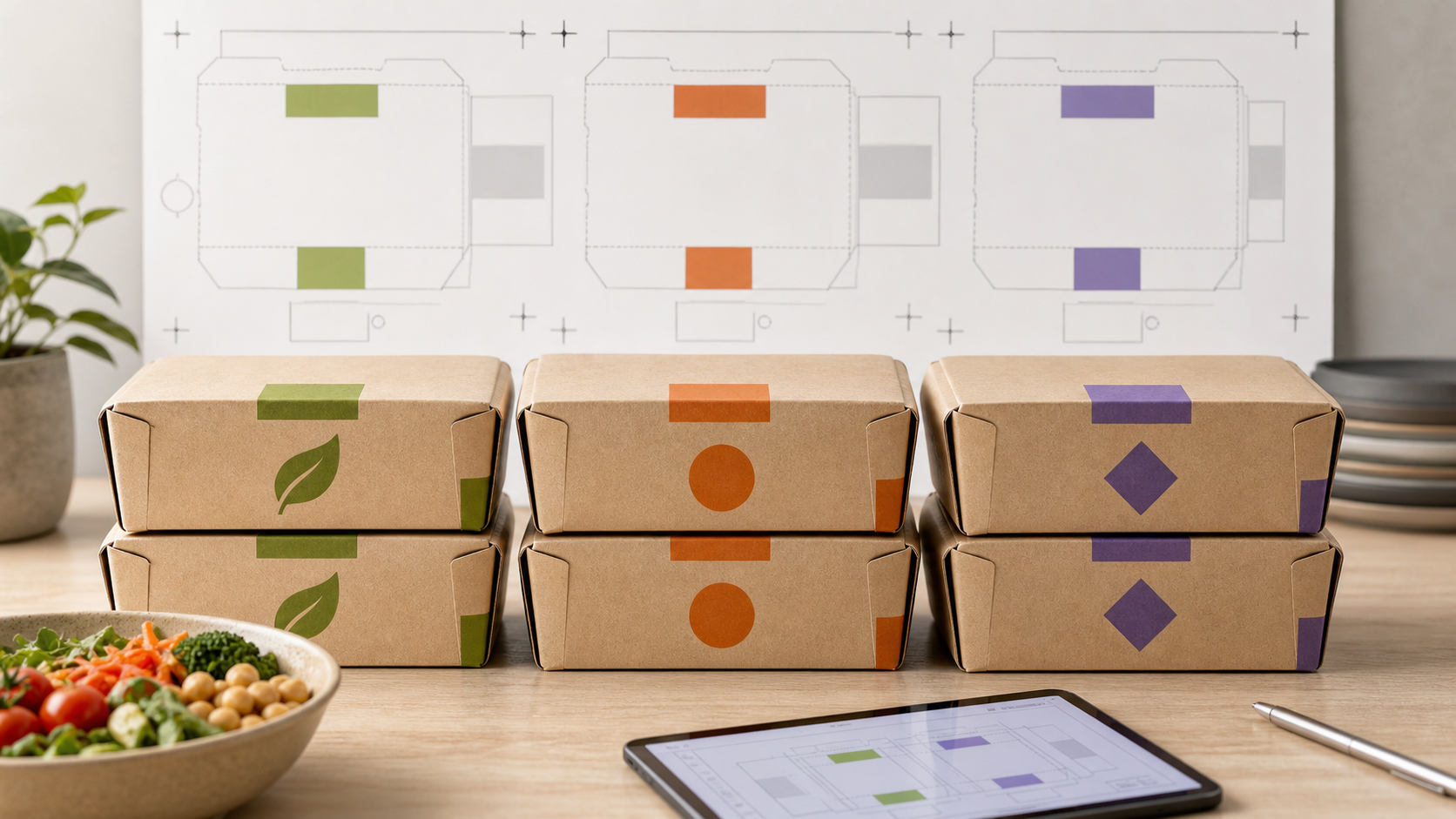
The exact printable layout depends on the selected box structure, material, and supplier’s production setup. Still, event teams can prepare an artwork brief around three functional zones and then ask which zones are available on the quoted format.
1. Primary recognition panel: the first visible face
The primary recognition panel is the outward-facing area that staff and attendees are most likely to see when boxes are placed for collection. It is the preferred candidate for the large dietary category, the strongest color band or icon, and a restrained version of the catering brand.
For a pickup line, the category should remain recognizable without picking up the box. Build this panel around one decisive message rather than a dense collection of logos, menu text, and small qualifiers. If the chosen box will be stacked or positioned in a particular direction, include that real setup in the artwork review.
Ask the supplier to confirm:
- the proposed primary panel on the actual quoted box drawing or dieline;
- safe margins and any areas affected by folds, seams, closures, or glue;
- how the category text and color treatment appear on a production proof or approved digital artwork proof;
- whether the selected quantity and artwork version support the requested customization discussion.
2. Secondary information panel: the close-reading face
The secondary panel is a candidate location for the allergen advisory, classification note, menu description, service instructions, or a smaller event identifier. It supports people who already have the meal in hand and need more detail without crowding the high-priority category cue.
Use short, standardized copy. Avoid turning the panel into an ingredient, compliance, or safety claim unless the event’s responsible team has approved and verified that wording for the meal. The packaging artwork should reproduce the approved information; it should not become the source of a new promise.
A useful design check is to print the draft at approximate package scale and read it at arm’s length, then at handling distance. If a volunteer cannot distinguish the category from the advisory, the hierarchy is reversed. If an attendee cannot read the advisory without hunting around the box, the secondary information needs a clearer location or simpler wording.
3. Handoff-facing zone: the surface staff see while sorting
Some box formats may have a top-facing, side-facing, closure-facing, or other handling-oriented surface that is useful when meals are staged in rows. Treat this as a functional zone to validate, not an assumed printable area.
Where a quoted format permits it, this zone can repeat a compact category cue or use a controlled handoff identifier. Repetition can help sorting, but it must match the primary panel exactly. Do not create a second, slightly different version of the category language.
The key questions are operational: Will the cue remain visible when boxes are stacked? Does the closure or fold interrupt the message? Can staff see the cue in the expected pickup orientation? The answers should be reviewed against the actual dieline and intended setup, not inferred from a generic product image.
Separate Brand Design From Routing Design
Catering branding and dietary routing are both important, but they answer different questions.
- The brand answers: “Whose catering program is this?”
- The dietary category answers: “Where does this meal go, and who is it intended for?”
- The advisory and classification note answer: “What extra information must be read or escalated?”
A common mistake is to let the brand mark occupy the largest, clearest position while the dietary category becomes a small sticker-like afterthought. In a conference distribution line, the routing message should usually win the visual hierarchy. Branding can remain prominent enough to support the event experience without making staff search for the category.
Create a simple content map before final artwork. Mark each proposed print zone and place only the information that must work in that viewing moment. This helps prevent duplicate copy, conflicting directions, and last-minute additions that make the design unreadable.
A Production-Ready Artwork and Placement Verification Workflow
A no-confusion system is not completed when a designer exports a PDF. It is completed when the intended information, actual box format, and handoff workflow have been checked together.
Step 1: Freeze the operating categories
Define the limited set of main categories, identify overlap cases, and assign a controlled exception process. Do not create new labels at the packing table. For combined needs, decide whether the meal receives a primary category plus an approved secondary marker or is handled by the exception lead.
Step 2: Prepare a structured RFQ brief
Include the product or category under consideration, material, size or capacity, expected quantity, destination, catering-brand artwork, dietary-category artwork, color requirements, and the proposed placement map. Attach the requested copy in a text-controlled document so it can be compared against the visual artwork.
For a custom packaging request, the brief should also state that print-zone feasibility must be verified for the specific selected box and artwork. This creates a record that the team is seeking confirmation rather than assuming every panel, color treatment, or finish is available.
Step 3: Request the relevant dieline or drawing and a digital proof
Review the actual layout provided for the proposed item. Check folds, closure lines, glue areas, margins, orientation, and any location where text could be obscured during use. Compare the proof with the content map, not only with the designer’s screen mockup.
For custom printed packaging, TakeawayPack states that a PDF dieline mock-up is made from customer-provided files and production begins after the customer has approved the digital proof in writing. That makes proof review an appropriate control point for confirming whether the requested artwork can be considered for the defined order.
Step 4: Perform a line-of-sight test
Place a proof or representative mockup in the intended service configuration. Test how it reads when boxes are lined up, stacked, and handed across a table. Ask a person who did not design the system to route several example meals using only the package information and the pickup signage.
Record what they misread. Typical fixes include enlarging the category, reducing nonessential branding on the primary panel, moving the advisory to a clearer secondary panel, or simplifying the classification note.
Step 5: Lock a version-controlled approval record
Keep one approved artwork version, one content sheet, and one correspondence trail for the order. If a menu component or category term changes, reopen the review rather than editing a single panel informally. This protects the consistency of the packing, staging, and pickup system.
What to Ask About Mass-Production Print Feasibility
Do not ask only, “Can you print this?” Ask questions that connect artwork to the actual production order:
- Which panels or zones on this specific box format can be considered for the proposed artwork?
- Which areas must remain clear because of folds, seams, closures, glue, or the selected structure?
- Can the supplier provide a drawing, dieline, or digital proof showing the proposed placement at the quoted configuration?
- What artwork file requirements, color information, and approval steps apply to this request?
- Does the requested quantity affect the customization discussion or available production approach?
- Can the proof show the catering brand, category cue, advisory copy, and classification note in their proposed hierarchy?
- Who on the event side approves category wording and advisory copy before written proof approval?
These questions do not guarantee a specific printing method, ink, coating, location, or outcome. They give both sides a disciplined way to verify feasibility before a production commitment.
On-Site Controls That Keep Packaging Information Useful
Even excellent artwork cannot compensate for a weak distribution plan. Use the same category wording and visual convention on package artwork, pickup signage, staff notes, and any attendee ticket or badge indicator. Give volunteers a short instruction: route uncertain cases to the designated exception lead instead of interpreting packaging language on their own.
Keep backup meals separated by category in a clearly marked staging area. Avoid moving packages between categories because a box “looks similar.” If the event policy permits release of unclaimed meals later, define the time and decision owner in advance.
The result is a handoff system where packaging information supports decisions at the right moment: staff can sort, attendees can recognize, and exception handling stays controlled.
Plan Custom Meal-Box Artwork With TakeawayPack
If your event team is developing branded meal-box artwork, TakeawayPack can discuss a custom packaging RFQ using project details such as product category, material, size or capacity, quantity, printing or logo requirements, and destination. Its public materials also describe discussion of customization during the RFQ process and digital-proof approval for custom printed orders. Actual printable zones, materials, artwork feasibility, and production details must be verified for the specific box format and confirmed artwork—not assumed from a general category or website image.