How to Keep a QR Code Scannable on Custom Paper Cups and Bags
A QR code on foodservice packaging should be treated as a functional print element, not a decoration. For a small-batch café launch or brand refresh, the safest route is to choose a smooth, stable print panel; keep the code away from seams, folds, rims, handles, and curved transitions; use a high-contrast two-colour layout; and approve the production artwork only after scanning real samples under normal use conditions.
2026-08-20 - 6 min read
Summary
A QR code on foodservice packaging should be treated as a functional print element, not a decoration. For a small-batch café launch or brand refresh, the safest route is to choose a smooth, stable print panel; keep the code away from seams, folds, rims, handles, and curved transitions; use a high-contrast two-colour layout; and approve the production artwork only after scanning real samples under normal use conditions.
A brand with two core colours can still use a QR code effectively on cups and paper bags. The key is not to make the code compete with the rest of the identity. A QR code needs clean geometry, a quiet area around it, reliable contrast, and a surface that does not distort it. If any of those conditions is weakened, a code that works on a screen may fail on a finished cup or bag.
Start with the packaging structure
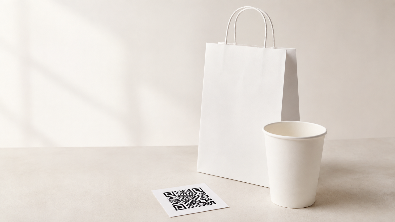
Choose the code location before finalising the artwork. On a paper cup, the most dependable location is the broad central sidewall panel. Keep it away from the rolled rim, base curve, vertical side seam, and the area where a sleeve or hand commonly covers the cup. These areas can introduce curvature, overlap, shadow, abrasion, or visual interruption.
For a paper bag, use the largest uninterrupted front or back face. Do not place a code across a bottom fold, side gusset, handle reinforcement, crease line, or panel edge. A bag can look flat in a digital mock-up yet crease substantially during filling and carrying. Leave sufficient space around the code so nearby graphics do not visually merge into its modules.
The product structure should support the purpose of the design. The TakeawayPack catalogue describes a single-wall paper cup with a smooth print surface and flexographic or offset print options. It also lists double-wall hot cups with a premium print surface and custom print or embossing options, while ripple-wall cups have a deliberately textured exterior. That means a designer should confirm the actual cup construction before assigning a compact QR code: a smooth panel is usually the easier starting point for a code than a textured grip area.
Use one colour for the code and one for the brand
Two brand colours are enough when the hierarchy is clear. Use the darker, more solid colour for the QR modules and reserve the lighter colour for the surrounding brand system. The background behind the code should be light and visually quiet. Avoid gradients, texture, halftones, illustrations, photography, metallic effects, or a pattern behind the code.
Do not reverse a small QR code out of a dark background unless the printer and the intended phone-scanning conditions have been tested on real production material. Dark modules on a light background are generally easier to inspect and are less dependent on edge quality. Keep the finder patterns—the three larger corner squares—clear and unobstructed.
Give the code a deliberate quiet zone: a plain border on all four sides with no logo, slogan, illustration, rule, or coloured frame touching it. The quiet zone is not wasted space; it helps the camera identify the code boundary. If the layout feels crowded, enlarge the packaging panel or simplify the surrounding design rather than shrinking the quiet zone.
Select a code size for the real scan distance
The final size should come from the code content, print method, substrate, expected scan distance, and the phone cameras your customers actually use. A short destination URL or controlled dynamic QR destination can permit a simpler code than a long unshortened link. Simpler code patterns generally tolerate printing variation more comfortably.
Do not approve a size solely from a digital proof. Ask the printer for a physical pre-production sample or production-representative proof. Scan it with several current phones, at the expected hand-held distance, in indoor café lighting and in brighter daylight. Repeat the test after the cup is formed and after the bag has been folded, filled, and handled.
For a QR code intended for a cup, scan the code while the cup is upright, held in the hand, and partly rotated. For a paper bag, scan it both flat and when the bag is filled. These checks expose the real effects of curvature, seams, creases, gloss, shadows, and handling.
Match the printing process to the risk
The print process must reproduce clean square modules and consistent edges. The TakeawayPack catalogue lists flexographic and offset printing for its single-wall paper cups. Treat those as options to discuss with the supplier, not as an automatic guarantee for every design. Provide final vector artwork, specify the exact colour values, and ask the printer to confirm the smallest reliable module size for the selected substrate, construction, ink system, and artwork.
A compact code has less tolerance for dot gain, ink spread, misregistration, or substrate texture. If the code must remain small, reduce its data complexity and keep the surrounding panel simple. If the design calls for embossing, texture, or a seam-adjacent placement, keep the QR code on a separate smooth, flat panel rather than trying to make it share that feature.
Use an approval checklist before the production run
Before authorising production, check the following on an actual sample:
- The QR code sits entirely on one stable printable panel.
- No rim, seam, fold, gusset, handle patch, sleeve, or closure crosses the code or its quiet zone.
- The code uses a solid dark foreground on a light, plain background.
- The logo and decorative graphics do not intrude into the quiet zone.
- The printed code scans with multiple phones under realistic lighting and handling conditions.
- The scan destination opens quickly, works on mobile, and matches the campaign or menu message.
- The approved artwork, print specification, sample photos, and scan-test result are retained with the purchase order.
A practical small-batch path for cafés and regional chains
For an opening, seasonal relaunch, or multi-site brand refresh, begin with one cup or bag structure and one code placement. Print a controlled pilot, test it in the service environment, then release the same approved placement across related sizes or bag formats only after each construction is verified. This avoids treating a successful flat-bag code as proof that a curved cup code will behave identically.
TakeawayPack’s catalogue includes paper-cup formats and paper-bag options that can support a branded packaging brief. Share the intended QR destination, two-colour artwork, chosen product construction, placement panel, and sample-test requirement at the start of the quotation discussion. A supplier can then review the job as a packaging-and-print system rather than as a logo placement alone.
For help planning a custom-printed cup or paper-bag programme, explore TakeawayPack and bring your two-colour artwork, QR destination, and intended use case to the conversation.