Transparent Food Gift Boxes: How to Use Product Visibility Without Losing Brand Space
Transparent food packaging can help a gift, bakery item, snack, or prepared food look immediately understandable at the point of display. The design brief should not begin with “make it clear.” It should define what customers need to see, what the pack must keep visually quiet, and where the brand message belongs. A viewing window, a label area, or a printed outer panel can each support the same presentation goal in a different way.
2026-08-19 - 4 min read
Summary
Transparent food packaging can help a gift, bakery item, snack, or prepared food look immediately understandable at the point of display. The design brief should not begin with “make it clear.” It should define what customers need to see, what the pack must keep visually quiet, and where the brand message belongs. A viewing window, a label area, or a printed outer panel can each support the same presentation goal in a different way.
Let the Food Do Part of the Selling
When the product has strong visual appeal, showing it can reduce the need for a long explanation on the front of the pack. A neatly arranged assortment, a layered dessert, or a freshly prepared sandwich can communicate its own character before the customer reads a word.
That does not mean every surface should be transparent. The useful question is whether the visible area shows the product at its best from the angle a customer will actually see.
A small window can create a focused preview. A larger clear panel can make the product the central visual element. The right choice depends on the item, its arrangement, and how the pack will be displayed.
Choose the Visibility Level Before the Decoration
A transparent display concept works best when the visibility rule is written before artwork begins. Decide what must remain visible after the pack is filled, closed, labeled, and placed on shelf.
A Viewing Window for a Controlled Preview
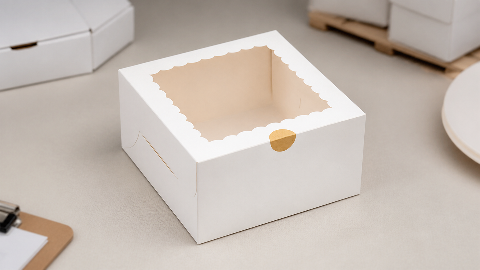
A window lets a buyer see a selected part of the food while leaving surrounding panels available for a logo, brand color, product name, or gift message.
This can be helpful when the contents look best from one side. It also gives the design team a defined area to protect from label placement or overly busy graphics.
A Clear Area for the Full Arrangement
A larger clear area puts more of the arrangement in view. It can suit products whose colors, shapes, or layers are part of the reason people choose them.
The trade-off is that every visible interior detail becomes part of the presentation. The product position, insert, closure, and label placement should therefore be reviewed together rather than as separate decisions.
Keep Brand Color From Covering the Product
A clear pack does not remove the need for branding. It changes where the branding can do its work.
Use the opaque parts of the pack to frame the food instead of competing with it. A band, side panel, base panel, or small label zone can carry a brand color while the visible area remains focused on the product.
Plan a Band or Label Zone Early
If a sleeve, band, or label is part of the concept, identify its position before approving the window size. Ask whether it will cover the most attractive part of the food, obscure a product name, or interrupt the intended sightline.
A simple brief can state:
- the part of the food that must be visible;
- the front-facing display angle;
- the maximum area a label or band may cover;
- the brand colors and artwork elements to include; and
- whether the pack will carry a seasonal, gift, or everyday message.
This makes “fresh-looking” a practical design direction rather than a vague preference.
Review the Filled Pack, Not Only the Flat Artwork
Transparent packaging is judged after the food is inside. A design that looks balanced as a flat drawing may look different after filling, closing, stacking, or applying a label.
Review a filled sample or visual mock-up using the actual portion and arrangement. Look at it from the shelf-facing angle, the handoff angle, and the customer’s opening angle.
Check whether the product remains the visual focus. Also check whether the branded elements still read clearly without covering the product view.
Make the Display Brief Specific for a Supplier Discussion
The supplier conversation is more useful when it begins with the food and the display objective, not just a request for “transparent packaging.” Share the food type, portion, desired viewing area, pack format, brand artwork, label or band concept, and destination.
Takeawaypack’s verified catalog data includes food-packaging records with clear viewing-window formats. The same catalog data records full-color, silkscreen, and unprinted print choices for relevant packaging records.
That makes it reasonable to bring a visibility-and-branding brief to Takeawaypack for discussion. It does not establish that every window, print method, material, size, or decoration layout is available for every project; those details need configuration-specific confirmation.
Product visibility works when it is treated as part of the design system. Define what should be seen first, protect that view, and use the remaining space to make the brand recognizable.
https://takeawaypack.com